Diversification is one of the first things most people learn about investing. The phrase “don’t put all your eggs in one basket” probably sounds familiar.
At its core, diversification means that when we build a portfolio we want to dump in a bunch of different investments with different risk profiles. That way they’re not all likely to fall in value at the same time. They work “together” to reduce risk.
Think of it like baking a cake. Dumping a bunch of flour in a cake pan and tossing it in the oven probably won’t turn out very good. But when you add sugar, milk, and eggs in the proper ratio, you’re a lot more likely to get a desirable result.
Typically, investors accomplish this by investing in two primary assets classes: stocks and bonds. Stocks and bonds are very different animals, which is really the whole point. In most circumstances one goes up when the other tends to go down, and vice versa.
There’s an interesting phenomenon that’s often overlooked when we view our investments this way though. While we like to think that stocks and bonds “work together” to reduce risk, they actually compete against each other in the capital markets. This behavior is a major reason we’ve seen such strong equity returns over the last few years, and will likely help to explain what kind of returns we see over the next 5-10 years & beyond.
This post will dive into this concept, what’s currently driving stock prices, and what’s likely to happen next.

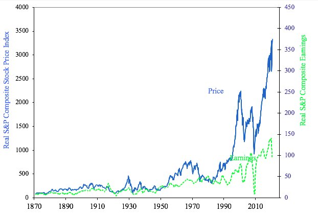
Long term real S&P Composite price index vs. earnings. Source: Robert Shiller’s Online Database: http://www.econ.yale.edu/~shiller/data.htm

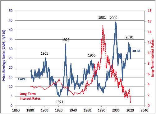
Long term CAPE vs. long term U.S. interest rates. Source: Robert Shiller’s Online Database: http://www.econ.yale.edu/~shiller/data.htm
Cyclically Adjusted vs. Point In Time P/E
The two confusing looking charts above show us some really interesting information. Chart #1 shows us real time prices of the S&P since 1870 in blue. In green it shows the earnings produced by that group of companies.
You may see where I’m going here. The price to earnings multiple is a famous way to determine how expensive a stock or group of stocks is. If you have a company that produces $10 of earnings per share of equity & trades for $100, it’d have a P/E of 10 (100 / 10). If that same company produced $20 per share of earnings, it’d have a P/E of 100 / 20 = 5. Thus, when you buy stocks with low P/E multiples you’re buying earnings streams for less cost.
Now, this doesn’t imply that stocks with high P/E multiples are crummy investments. Look at pretty much any high return tech company over the last decade. Amazon, for example, is exceptionally expensive by measure of P/E ratio. But it’s a fast growing company with a very strong outlook. So while P/E ratio is a helpful metric, it’s far from perfect because it doesn’t tell us much about growth expectations or earnings qualify.
On top of that, earnings of publicly traded corporations tend to bounce around quite a bit from year to year. Dividing share price by a 12-month snapshot of earnings omits a big part of a company’s (or index’s) story.
That’s where chart #2 comes into play. Some years ago, Nobel laureate Robert Shiller began advocating for the use of a cyclically adjusted P/E ratio. Rather than evaluating P/E using one single year’s worth of earnings, Shiller found it more useful to use a 10-year average. This works to smooth out the aberrations in corporate earnings that pop up from time to time, and offers a better snapshot of value.
The blue line in chart #2 is just that: the cyclically adjusted (aka “Shiller”) P/E ratio. You can see high points over the last 150 years just before bear markets: in 1901, 1929, and 2000.
The red line shows long term interest rates over the same time period.
Competition Between Asset Classes
See any trends in chart #2?
The first item that jumps out at me is the relationship between the two lines at peaks and troughs. Look at 1901 & 1929. They look pretty similar to the period we’re in now, where P/E ratios are high and long term rates are very low. 1981 looks to be the exact opposite, where P/E ratios were exceptionally low compared to long term rates.
Each of these periods was a turning point in U.S. economic history. And putting them side by side we start to see the inverse relationship between smoothed P/E ratios and long term interest rates. When one is at a high point, the other is often at a low point.
This chart highlights a very important point about how capital markets work: asset classes tend to “compete” against each other for investor dollars.
Think back to 1981, which was exactly ten years after the U.S. departed from the fixed exchange rate to gold (aka the gold standard). Prices rose nearly uncontrollably, and in order to rein inflation back in the Federal Reserve was forced to raise short term interest rates into the upper teens.
Investors trying to decide where to invest idle cash had high interest rates working to their advantage, and didn’t see much reason to take equity risk. Why would you take stock market risk when you can walk into a bank and pick up a CD with 15% returns?
With so much capital directed straight into the cash and bond markets, demand for equity shares waned. And relative to the rolling 10-year earnings these companies produced, their shares were priced exceptionally low.
Flipping the Script via Earnings Yield
Another way to look at this is to consider equity valuations in terms of yield rather than earnings multiples like P/E ratio. While the price to earnings ratio gives you a multiple at which company earnings trade, the inverse gives you a company’s earning yield. E/P (earnings divided by price) uses the exact same data, and tells us how much corporate earnings we can by per dollar invested. This allows us to compare stock yields with bond yields more directly.
Now take another look at the chart above. In 1981, stocks and bonds were both pretty cheap: yields were high, P/E ratios were low. Again, investors could capture enough return through the bond markets that they had little need to take equity risk.
Today, that relationship between earnings yields and long term interest rates is just the opposite of what it looked like in 1981. Bonds yields are exceptionally low. And even though earnings yields are also low (aka P/E ratios are high), investors are forced into equities because there’s nowhere else to find return. Which further drives up prices relative to 10-year rolling earnings periods.
Where Do We Go From Here?
So the low interest rate environment has helped prop up the stock market. Low rates don’t magically appear out of thin air though. The Federal Reserve bank sets short term interest rates, using its dual mandate as a guide. First and foremost, the Fed is tasked with using monetary policy to promote the stability of the U.S. dollar. Secondarily, once prices are stable, its objective is to promote full employment.
As you’ve probably heard, we’re in the middle of a pandemic right now. Businesses across the country have been shut down for months, causing unemployment numbers to surge. And since we haven’t seen much inflation yet (meaning prices are stable & objective #1 is met), the Fed’s focused heavily on promoting full employment. This is why short term interest rates are so low.
Long term interest rates are a different animal. They’re market based, and typically convey the bond market’s longer term economic expectations. But that doesn’t mean the Fed doesn’t intervene. In an effort to shore up the bond market and suppress long term rates (again, to stimulate the economy), the Fed is now buying bond funds.
Let’s quickly take stock here. COVID-19 has crushed the economy. The Fed’s intervened through massive monetary stimulus, depressing both short term and long term interest rates. With bond returns so low investors are forced into stocks, causing the stretched P/E ratios we’re seeing now.
So what happens next?
We shouldn’t jump to the conclusion that the market’s about to tank because the Shiller P/E ratio in chart #2 is high. We’re in a period where the Fed will continue stimulative measures until things improve or inflation creeps into the picture. That’s likely to drive equities higher in the near term. Plus, P/E ratio (Shiller or otherwise) is not an accurate predictor of market returns.
But over longer periods the Shiller P/E ratio has been effective, which implies that equity returns over the next 10-20 years might not turn out as strong as we’re used to. Or at least what we’ve been spoiled with recently.
Of course, none of this means that you should make any changes to your long term strategy. As always, stay consistent and stay diversified. And be aware that your stocks are fighting your bonds for returns.

